

Pictogram Charts: A Versatile Tool for Visualization
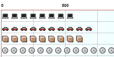
The ability to visualize data effectively is invaluable for any organization, facilitating better decision-making and providing visible insights into status and progress. One of the standout tools available for achieving this in SharePoint is the Pictogram Chart, available at SharePointDashboards.com. These charts allow for the visualization of values using a diverse array of icons, providing a unique and engaging way to present data.
How Pictogram Charts Fit into Charting and Visual Status Indicators
Pictogram Charts are a crucial tool in the realm of charting and visual status indicators. By enabling the use of various icons to represent data points, these charts transform complex data into easily understandable and visually appealing formats. Whether you're representing employee performance, tracking project milestones, or displaying sales figures, Pictogram Charts provide an efficient and clear method to convey information.
With just three fields required for each SharePoint list record-a label field, a number field, and an icon field-users can craft compelling and informative visual charts. This simplicity removes the barriers typically associated with data visualization, such as cost and complexity, particularly when compared to more expensive tools like Power BI.
Task and Employee Management
Effective task and employee management are essential components of any successful organization. Pictogram Charts contribute significantly to these areas by providing instant visual feedback on various metrics such as task completion status, employee performance, and resource allocation. By adjusting scale, colors, borders, and spacing, managers can tailor these charts to suit their specific needs and organizational aesthetics.
This ability to customize ensures that each chart aligns with corporate branding and provides meaningful insights that support informed decision-making.
Integration with Human Resources Processes
The integration potential of Pictogram Charts with Human Resources (HR) processes cannot be overstated. HR departments can use these charts to monitor and present a multitude of metrics, such as employee attendance, skill level distributions, or departmental KPIs. This equates to a more dynamic and easily interpretable data set than traditional spreadsheets or text-heavy reports.
With the ability to share these charts throughout the organization, HR can ensure that relevant stakeholders are informed and aligned with company goals and progress. This transparency contributes to smoother operations and better alignment between employees and organizational objectives.
Setting Up Pictogram Charts in SharePoint
Setting up Pictogram Charts in SharePoint is a hassle-free process thanks to SharePointDashboards.com. Users can implement these charts by employing a simple copy-and-paste template. This easy-to-use method as provided by SharePointDashboards.com, means that anyone, regardless of their technical expertise, can implement a sophisticated data visualization tool within their existing SharePoint environment.
Additionally, with access to over 36 different charting templates, SharePointDashboards.com offers tremendous flexibility, allowing for a wide range of data visualization possibilities that cater to almost any organizational need.
SharePoint JSON Formatting and Template Application
To further enhance the appearance and functionality of SharePoint lists, JSON formatting can be applied. By using JSON formatted templates from SharePointDashboards.com, users can easily apply color coding, font changes, and iconography to their SharePoint list views. This not only ensures a visually appealing format but also facilitates easier data interpretation and analysis.
Creating a JSON formatted view involves applying a JSON template to a SharePoint list view, which transforms the list's standard display into a rich, visually engaging experience. It is especially helpful for tracking progress, evaluating project health, and supporting managerial decision-making.
Use Case Scenarios
Pictogram Charts offer numerous applications across various departments and industries. Here are a few scenarios highlighting their versatility:
- Project Management: Project managers can use Pictogram Charts to showcase the status of project tasks, deadlines, and resource allocation. By providing a visual representation of progress, team members stay informed, and deviations from the plan are easily spotted.
- Sales Performance: Visualize monthly or quarterly sales targets, achievements, and trends using icons that depict sales figures succinctly. This helps sales teams quickly assess their performance and make strategic decisions.
- Human Resources: Displaying employee metrics through Pictogram Charts enables HR to assess workforce allocation, performance levels, and qualification distributions in an easily digestible format.
Conclusion
The introduction of Pictogram Charts via SharePointDashboards.com represents a significant step forward in the realm of data visualization. These charts are exceptionally user-friendly, allowing organizations to create visually compelling data representations without the need for expensive software solutions. Their application across task management, employee tracking, and HR processes makes them an invaluable tool for modern business needs.
As organizations strive to present data in more engaging and accessible ways, tools like the Pictogram Chart will undoubtedly play a crucial role in enhancing communication, supporting decision-making, and aligning teams with corporate objectives.