Introduction to the Marimekko Chart for SharePoint
The Marimekko Chart for SharePoint, featured on
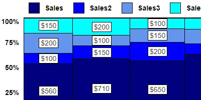
SharePointDashboards.com, emerges as one of the most intriguing and dynamic charts available for use in SharePoint lists. A Marimekko chart, sometimes referred to as a Mekko chart, serves as a sophisticated hybrid between a stacked bar chart and a bubble chart. This charting tool enables users to visualize two dimensions of magnitude simultaneously, resulting in a powerful visual representation that communicates complex data interactions effectively.
Understanding the Dynamics of a Marimekko Chart
Marimekko charts stand out for their ability to display multi-dimensional data in a single, comprehensive view. Here's how they work:
- Width of Columns: Each column's width represents a specific variable, providing insights into the distribution or comparative analysis of that variable across different categories.
- Height of Segments: Within each column, segments are stacked vertically to represent percentages or compositions, showcasing the breakdown of data within each category.
- Area Representation: The overall area of each block in the chart represents the total contribution, helping visualize the cumulative impact or dominance of specific categories.
This remarkable capacity to represent market structures, portfolio compositions, resource allocations, or category dominance in one cohesive view grants users a deeper understanding of their data landscape.
Integration with Charting and Visual Status Indicators
Marimekko charts find their niche in the realm of charting and visual status indicators due to their ability to concisely display complex data sets. By integrating these charts into SharePoint, users can leverage visual cues to assess project statuses, resource allocations, and market conditions more intuitively.
The visual representation of data through such a chart enhances task management by allowing stakeholders to quickly discern priority areas or tasks requiring immediate attention based on their relative size or contribution. This method of data visualization acts as a visual status indicator, simplifying the complexity associated with traditional data presentations.
Enhancing Task and Employee Management
In the domains of task management and employee management, Marimekko charts offer significant value. These charts provide detailed insights into the allocation of resources and workforce deployment, allowing managers to optimize team structures and workflows efficiently.
For task management, the visual breakdown of tasks or project components within the chart aids in identifying bottlenecks or areas of high efficiency. In the context of employee management, these charts can illustrate the distribution of personnel across various projects or departments, assisting HR teams in strategic planning and resource management.
Compatibility with Human Resources Processes
Human Resources (HR) processes benefit substantially from the integration of Marimekko charts. These charts can visualize employee demographics, skill distributions, departmental allocations, and other HR-related metrics in a clear and concise manner. By presenting data in this format, HR professionals are equipped with the necessary insights to make data-driven decisions regarding hiring, training, and employee development.
With the ease of interpretation provided by Marimekko charts, HR teams can effectively track performance metrics, recruitment trends, and workforce diversity initiatives, aligning these insights with broader organizational objectives.
Setting Up the Marimekko Chart in SharePoint
The process of incorporating a Marimekko chart into SharePoint is streamlined through a simple copy and paste template available at
SharePointDashboards.com. This setup does not require extensive technical expertise, making it accessible to a wide range of users.
By following a comprehensive tutorial, users can configure the Marimekko chart in minutes, transforming their SharePoint data into interactive visualizations. This process enhances user engagement and empowers decision-makers with actionable insights available at their fingertips.
Use Case Scenarios
The versatility of the Marimekko chart lends itself to a wide array of use case scenarios. Here are a few examples:
- Market Analysis: Visualize market share distributions across different product categories, identifying leading segments and potential growth areas.
- Resource Allocation: Monitor the distribution of resources such as budget or personnel across various projects, optimizing resource allocation strategies.
- Project Management: Assess the breakdown of project components, identifying critical tasks and efficiently managing workloads.
- Portfolio Analysis: Gain insights into investment compositions, evaluating the performance of different assets within a portfolio.
Understanding SharePoint JSON Formatting
Integral to the Marimekko chart's functionality is the concept of SharePoint JSON formatting. This formatting allows users to customize list views to accommodate the visual requirements of the chart. By applying a predefined template to a SharePoint list view, users can effortlessly transform raw data into the Marimekko chart's interactive format.
This JSON formatting is a powerful tool that simplifies the visualization process while ensuring the chart remains dynamic and visually appealing. The integration of JSON through a templated approach streamlines data visualization within SharePoint, providing users with the flexibility to represent data according to their specific needs.
Conclusion
The Marimekko Chart for SharePoint is a dynamic and versatile tool, perfect for users seeking to enhance data visualization capabilities within their SharePoint environments. By offering insights into market structures, task management, resource allocations, and human resources processes, this chart elevates the decision-making capabilities of individuals and organizations alike.
With its easy setup through SharePointDashboards.com and comprehensive templated support for JSON formatting, the Marimekko chart stands as a valuable asset, transforming complex data interpretations into visually compelling narratives. Embrace the power of the Marimekko chart and unlock the potential of your data today.